When you think about invitations, whether for weddings, birthdays, or corporate events, the first thing that often comes to mind is their visual appeal. Colors, patterns, and layouts play a big role, but there’s one element that often gets overlooked: legible typography in invitation design. The style, size, and readability of the text can make or break an invitation. After all, the purpose of an invitation is to communicate essential information clearly while leaving a lasting impression.
Typography isn’t just about choosing a “pretty” font, it’s about creating a balance between elegance and legibility. If your guests struggle to read the details, even the most beautiful design will fall flat. That’s why understanding the importance of typography in invitation design is essential, especially when creating printable party invites that both look professional and function effectively.
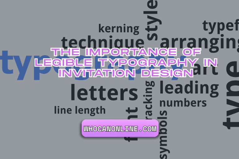
Why Legible Typography Matters More Than You Think
Typography is more than decoration, it’s communication. An invitation serves as both a visual introduction to the event and a source of practical details like date, time, and location. If your typography isn’t clear, you risk confusing guests or causing them to miss critical information.
Good typography ensures:
- Clarity: Guests can instantly read what’s important.
- Mood Setting: Fonts convey emotions, serif fonts feel formal, while sans-serif fonts lean modern.
- Hierarchy: Strategic font choices help readers quickly find what they need (e.g., bold titles, lighter subtext).
Think of typography as the “tone of voice” for your design. Just as you wouldn’t whisper key details of your event, you shouldn’t let poor font choices bury important information.
The Psychology Behind Font Choices
Different fonts trigger different associations. For example:
- Script fonts feel romantic and personal, which is why they’re common in wedding invitations.
- Bold sans-serif fonts communicate modernity and confidence, making them ideal for corporate gatherings.
- Playful handwritten fonts evoke warmth and creativity, perfect for kids’ parties or casual events.
According to research in visual communication, typography impacts not just readability but also perceived credibility. A study by MIT’s AgeLab found that harder-to-read fonts actually increase cognitive load, meaning readers spend more effort trying to decode text instead of absorbing the content.
The takeaway? Your typography isn’t just a design choice, it influences how your event is perceived and remembered.
Also Read: Seekde – Discover Content, Learn Online & Explore Topics
Actionable Tips for Better Legible Typography in Invitation Design
1. Prioritize Legibility Over Style
It’s tempting to choose ornate fonts, but if your guests can’t quickly read the time or location, they’ll be frustrated. Always test your font at the size it will be printed to ensure clarity.
2. Use a Clear Hierarchy
Make headlines (like the event name) stand out with larger or bolder text. Secondary details (like the dress code) should be slightly smaller but still readable.
3. Don’t Overcrowd the Design
White space is your friend. Invitations that are too cluttered with decorative fonts can look overwhelming. Let the text breathe.
4. Stick to Two or Three Fonts
Pairing fonts can add sophistication, but using too many creates visual chaos. A strong rule of thumb is:
- One font for headings
- One for body text
- An optional accent font for decorative flair
5. Think About Accessibility
Remember, not everyone has perfect eyesight. Avoid ultra-light fonts or text over busy backgrounds. High contrast between text and background ensures maximum readability.
Real-World Examples of legible Typography in Invitations
Consider a luxury wedding invite that uses gold-embossed script for the couple’s names but pairs it with a clean serif font for the event details. This combination offers elegance without sacrificing legibility.
On the other hand, imagine a children’s birthday party invite designed with bold, bubbly fonts that are fun and easy to read. The typography doesn’t just communicate information, it sets the tone before the guest even arrives.
In both cases, typography is doing double duty: it informs and it excites.
Digital vs. Print Considerations
Typography looks different on screens compared to printed paper. Digital invitations may allow for interactive fonts and animations, but print requires careful sizing and ink consideration. For example, fine-line fonts may look crisp on screen but blur when printed on textured cardstock.
If you’re working on designs that will become physical printable party invites, always order a sample print before finalizing. This ensures fonts don’t lose their impact in translation from digital to paper.
Common Mistakes to Avoid
- Overusing Script Fonts: Elegant but often hard to read in long passages.
- Tiny Font Sizes: Prioritize readability over fitting everything on one page.
- Ignoring Contrast: Dark fonts on dark backgrounds or light fonts on pastel tones quickly become illegible.
- Too Many Capitals: All-caps can be effective for emphasis but tiring if overused.
The Bottom Line
Invitations are more than just pretty pieces of paper or digital cards, they’re functional tools that set the stage for your event. Legible,typography is the unsung hero that ensures your design isn’t just beautiful but also practical. By prioritizing legibility, understanding font psychology, and testing your designs before print, you can create invitations that are both memorable and easy to read.
When designing your next set of invitations, remember this: a stunning font may catch the eye, but a legible font keeps your guests informed and excited to attend. Typography is not just an afterthought, it’s the foundation of effective invitation design.