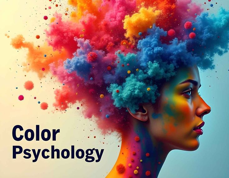
What Is Colour Psychology
Colour psychology is the study of how different colours influence human mood, emotions, and behaviour. In colour psychology, visual exposure to colour affects psychological responses such as calmness, excitement, focus, and emotional balance. These reactions occur because colours function as powerful visual stimuli that the brain processes through biological responses, personal experiences, and cultural associations.
Colour psychology explains how repeated exposure to specific colours can shape perception, influence decision-making, and affect mental states over time. As a result, colour psychology is widely applied in design, marketing, healthcare, education, and everyday environments to guide emotional responses, support mental well-being, improve communication, and influence human behaviour in subtle yet measurable ways.
Summary Box
Colour psychology examines the relationship between colorus and emotional or psychological responses in humans.
Color psychology explains how different colors influence mood, feelings, behavior, and mental perception.
According to colour psychology, the brain interprets colors as visual signals that trigger emotional and cognitive reactions.
The principles of colour psychology are widely applied in design, branding, marketing, healthcare, education, and daily environments to influence human responses in measurable ways.
Key Takeaways
- Color psychology studies how colors affect mood
- Responses can be emotional, mental, or behavioral
- Effects vary by context and individual perception
Common Misconceptions
- ❌ Colors affect everyone the same way
- ❌ One colour causes only one emotion
How Colors Influence Mood
Colors influence mood by triggering emotional and psychological responses in the brain, a process explained through colour psychology. Visual exposure to color affects attention, arousal levels, and emotional perception based on learned associations and biological responses. For example, brighter colors tend to stimulate energy and alertness, while softer tones encourage calmness and relaxation. Context, lighting, and personal experience also shape how color impacts mood.
Summary Box
Colour psychology explains how visual colour cues influence emotional states, feelings, and mental responses.
In colour psychology, the brain processes colours as psychological signals that affect mood, focus, and perception.
The principles of colour psychology help explain how repeated colour exposure can shape emotions and behaviour in everyday environments
Key Takeaways
- Colors act as visual stimuli that affect mood
- Emotional responses vary by context and experience
- Color psychology links perception with behavior
Common Misconceptions
- ❌ Color effects are universal
- ❌ Mood changes are instant and permanent
YOU CAN ALSO READ: What is Color Psycology?
The Role of Colours in Decision-Making and Human Perception
Colours play a significant role in how people perceive information and make decisions, often without conscious awareness. Visual cues created by colour influence attention, judgment, and emotional reactions, which directly affect choices in everyday life. From selecting products to interpreting warnings, colour serves as a silent guide that shapes perception and response.
How Colours Influence Attention and Focus
The human brain is naturally drawn to visual contrast. Certain colours attract attention faster than others because they stand out within an environment. Bright and saturated tones are more likely to capture focus, while softer shades tend to recede into the background. This effect explains why important signals, alerts, and notices often rely on strong visual contrast to ensure immediate recognition.
Colour-based attention is not random. The brain processes colour before text or shape, making it one of the fastest ways to communicate meaning. When colour is used strategically, it can guide the eye toward essential information and help individuals prioritize what matters most.
Emotional Processing and Cognitive Response
Colours influence emotional interpretation, which then affects cognitive processing. When people associate a colour with comfort or safety, they are more likely to feel relaxed and open to information. Conversely, colours linked to urgency or caution can trigger alertness and quicker reactions.
Emotional response plays a direct role in decision-making. Positive emotional cues can increase confidence and willingness to act, while negative cues may cause hesitation. Because emotions influence judgment, colour indirectly shapes how people evaluate options, assess risks, and form preferences.
Cultural and Learned Associations
Colour meaning is not universal. Cultural background, personal experience, and social conditioning heavily influence how colours are interpreted. A colour associated with celebration in one culture may represent mourning in another. These learned associations affect emotional response and behavior over time.
Repeated exposure strengthens these connections. When individuals consistently see a colour used in a specific context, the brain begins to link that colour with a particular meaning or expectation. This learned response influences future decisions, even when people are unaware of the influence.
Colour and Consumer Choices
In consumer environments, colour strongly affects purchasing behavior. Packaging, branding, and visual presentation rely on colour to communicate value, quality, and emotional appeal. People often form an impression of a product within seconds, and colour plays a central role in that initial judgment.
Decision-making in shopping environments is frequently emotional rather than purely logical. Colours that create trust, excitement, or comfort can influence preference and brand loyalty. This effect explains why similar products with different visual designs can produce different consumer reactions, even when functionality is identical.
Impact on Environmental Perception
Colour also shapes how people perceive physical spaces. Lighter tones can make areas feel open and calm, while darker shades may create a sense of intimacy or seriousness. These perceptions affect behavior, productivity, and comfort levels in workspaces, homes, and public environments.
Environmental colour choices influence how long people stay in a space, how they interact with others, and how they feel during the experience. Thoughtful colour selection supports clarity, reduces stress, and improves overall engagement with the environment.
Psychological Influence on Risk and Urgency
Certain colours are commonly associated with warnings, urgency, or importance due to biological and learned responses. High-contrast colours are easier to recognize quickly, making them effective for signals that require immediate attention.
When individuals encounter these colours, the brain often shifts into a heightened awareness state. This response can speed up decision-making and reduce reaction time. As a result, colour is frequently used in safety systems, navigation tools, and instructional design.
Memory and Information Retention
Colour influences how information is remembered. Visual content that uses colour effectively is more likely to be retained than content presented in neutral tones alone. Colour creates visual markers that help the brain organize and recall information more efficiently.
When colours are used consistently to categorize or highlight information, they improve comprehension and memory retention. This principle is widely applied in educational materials, data visualization, and instructional content.
Long-Term Behavioral Influence
Over time, repeated colour exposure can shape habits and behavioral patterns. When certain colours are consistently linked to positive or negative experiences, individuals may develop automatic responses. These patterns influence preferences, routines, and even emotional regulation.
This long-term influence explains why colour choices matter beyond aesthetics. They affect how people feel, think, and behave across different contexts and life stages.
Practical Implications
Understanding how colour affects perception and decision-making allows for more intentional design of environments, communication, and visual systems. Whether used in education, healthcare, digital interfaces, or public spaces, colour can support clarity, emotional balance, and effective interaction.
When applied thoughtfully, colour becomes a functional tool rather than a decorative element. Its influence on perception and behavior highlights the importance of informed colour choices in shaping human experience.
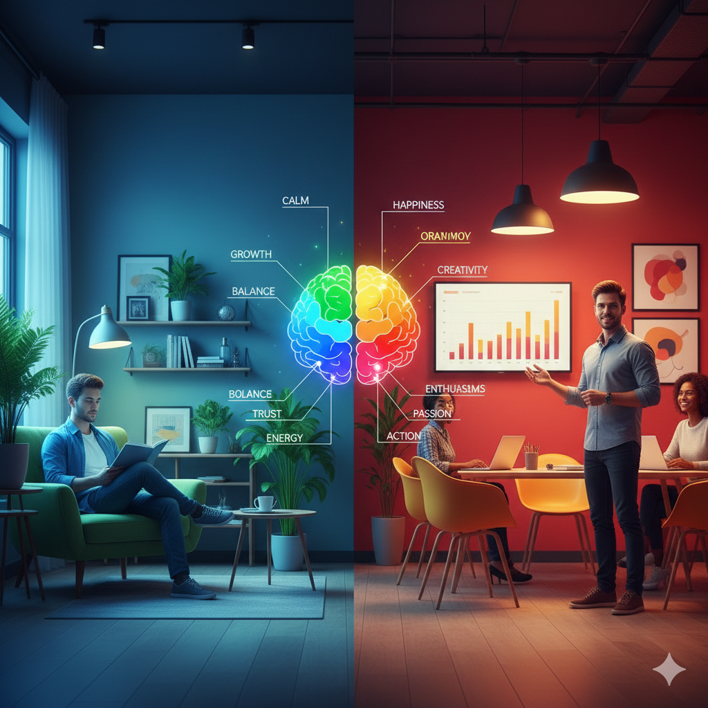
Warm Colors and Emotional Response
Warm colors such as red, orange, and yellow are commonly associated with energy, enthusiasm, and stimulation in color psychology. These colors tend to increase alertness and emotional intensity by activating the nervous system. Warm tones are often used in environments where activity, interaction, or motivation is encouraged. However, excessive exposure to warm colors may lead to feelings of restlessness or overstimulation, depending on personal sensitivity and context.
Summary Box
In colour psychology, warm colours are associated with stimulation, energy, and increased emotional activity.
Colour psychology explains that warm colours can trigger feelings of excitement, alertness, and motivation.
According to colour psychology, exposure to warm colours may heighten emotional responses and influence behavior.
Key Takeaways
- Warm colors increase alertness and energy
- Common warm colors include red, orange, and yellow
- Overuse may cause overstimulation
Common Misconceptions
- ❌ Warm colors always create positive emotions
- ❌ Strong colors affect everyone equally
Cool Colors and Emotional Response
Cool colours such as blue, green, and purple are associated with calmness, balance, and emotional stability in colour psychology. These colours tend to reduce stress levels and promote relaxation by creating a sense of harmony and mental clarity. Cool tones are commonly used in spaces designed for rest, focus, or emotional comfort. However, excessive use of very cool shades may sometimes feel distant or uninviting, depending on context and personal perception.
Summary Box
Cool colors are linked to relaxation, emotional balance, and reduced stress.
Key Takeaways
- Cool colors promote calmness and focus
- Common cool colors include blue, green, and purple
- Context influences emotional impact
Common Misconceptions
- ❌ Cool colors always feel calming
- ❌ One shade has the same effect in every setting
Neutral Colors and Mood Balance
Neutral colors such as white, gray, beige, and brown play an important role in maintaining emotional balance in colour psychology. These colors create a sense of simplicity, stability, and visual rest, helping to reduce overstimulation from brighter tones. Neutral shades are often used as background colors to support focus and comfort. However, excessive use of neutral colors without variation may feel dull or emotionally flat, depending on the environment.
Summary Box
Neutral colors support mood balance by creating calm and stable visual environments.
Key Takeaways
- Neutral colors promote stability and simplicity
- Common neutrals include white, gray, and beige
- Balance is important to avoid emotional flatness
Common Misconceptions
- ❌ Neutral colors have no emotional impact
- ❌ Neutrals are always boring
Individual and Cultural Differences in Color Psychology
The impact of colors on mood varies across individuals and cultures, according to colour psychology. Personal experiences, memories, and emotional associations strongly influence how a color is perceived. Cultural background also plays a significant role, as colors can symbolize different meanings in different societies. For example, a color associated with positivity in one culture may represent formality or caution in another. These differences explain why color responses are not universal.
Summary Box
Color psychology recognizes that mood responses to color depend on personal and cultural context.
Key Takeaways
- Personal experiences shape color perception
- Cultural meanings influence emotional response
- Color effects are not universal
Common Misconceptions
- ❌ Colors have fixed meanings worldwide
- ❌ Everyone reacts the same way to colour
Practical Applications of Color Psychology
Colour psychology is widely applied in everyday life to influence mood, behaviour, and perception. In home and workplace environments, colours are selected to support relaxation, focus, or productivity. In marketing and branding, colour choices help shape emotional responses and consumer trust. Healthcare and educational spaces also use colour strategically to reduce stress and encourage comfort. These applications rely on understanding context, audience, and emotional goals.
Summary Box
Color psychology is applied in design, branding, and environments to support emotional and behavioral outcomes.
Key Takeaways
- Colors influence mood in daily environments
- Strategic color use supports focus and comfort
- Context determines effectiveness
When Colours Quietly Talk to the Mind
Colour psychology explains how colours silently influence thoughts, emotions, and behavioral responses without conscious awareness. By studying colour psychology, experts identify how specific hues can shape mental states such as calmness, motivation, or alertness across different settings. From living spaces to digital screens, colour psychology helps decode why certain colours feel comforting while others stimulate action, making it a valuable tool for understanding human perception and emotional balance.
Conclusion
Color psychology explains that colors can influence mood, emotions, and behavior by triggering psychological and emotional responses. Warm, cool, and neutral colors each affect mood in different ways, while individual experiences and cultural background shape how these effects are perceived. Although colors do not determine emotions on their own, thoughtful use of color can support emotional balance, focus, and well-being in everyday environments.
Frequently Asked Questions (FAQs)
1. Does color psychology really affect mood?
Yes, color psychology shows that colors can influence mood by affecting emotional responses, attention levels, and mental states, though effects vary by individual and context.
2. Which color has the strongest emotional impact?
Warm colors like red and orange often create stronger emotional reactions due to their stimulating nature, according to color psychology.
3. Can colors reduce stress?
Cool colors such as blue and green are commonly associated with relaxation and stress reduction in color psychology studies.
4. Does color affect everyone the same way?
No, personal experiences and cultural background influence how individuals respond emotionally to different colors.
5. How is color psychology used in daily life?
Color psychology is applied in interior design, workplaces, branding, education, and healthcare to influence mood and behavior.
REFRENCES
1. American Psychological Association (APA)
Why: Authoritative source on psychology and human behavior
Link:
https://www.apa.org/monitor/sep04/color
2. Verywell Mind – Psychology & Mental Health
Why: Expert-reviewed, psychology-focused explanations
Link:
https://www.verywellmind.com/color-psychology-2795824
3. Harvard Health Publishing
Why: Research-backed health and psychology content
Link:
https://www.health.harvard.edu/blog/the-power-of-color-2018041313578
4. Frontiers in Psychology (Peer-Reviewed Journal)
Why: Scientific research on perception and emotional response
Link:
https://www.frontiersin.org/articles/10.3389/fpsyg.2014.00368/full
5. Interaction Design Foundation
Why: Evidence-based application of colour psychology in design
Link:
https://www.interaction-design.org/literature/topics/color-psychology
COLOUR PSYCHOLOGYhttps://en.wikipedia.org/wiki/Color_psychology